flutter - 캐릭터 정보 앱 만들기
[최종 코드]
import 'package:flutter/material.dart';
void main(List<String> args) {
runApp(MyApp());
}
class MyApp extends StatelessWidget {
const MyApp({ Key? key }) : super(key: key);
@override
Widget build(BuildContext context) {
return MaterialApp(
debugShowCheckedModeBanner: false, // 우측 상단에 debug 띠 지우기
title: "BBANTO",
home: Grade(),
);
}
}
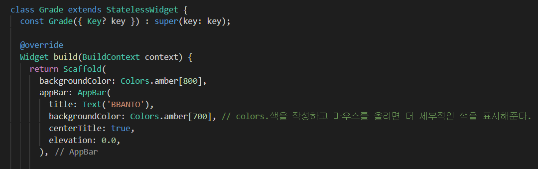
class Grade extends StatelessWidget {
const Grade({ Key? key }) : super(key: key);
@override
Widget build(BuildContext context) {
return Scaffold(
backgroundColor: Colors.amber[800],
appBar: AppBar(
title: Text('BBANTO'),
backgroundColor: Colors.amber[700], // colors.색을 작성하고 마우스를 올리면 더 세부적인 색을 표시해준다.
centerTitle: true,
elevation: 0.0,
),
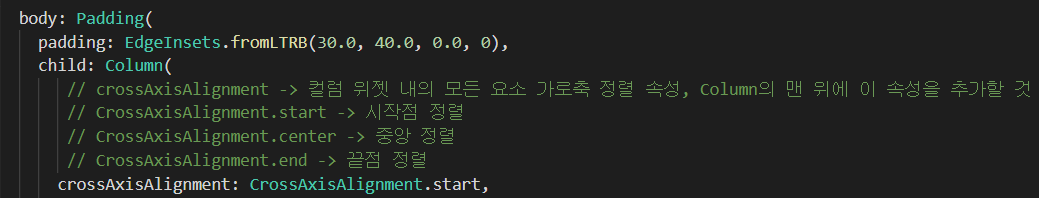
body: Padding(
padding: EdgeInsets.fromLTRB(30.0, 40.0, 0.0, 0),
child: Column(
// crossAxisAlignment -> 컬럼 위젯 내의 모든 요소 가로축 정렬 속성, Column의 맨 위에 이 속성을 추가할 것
// CrossAxisAlignment.start -> 시작점 정렬
// CrossAxisAlignment.center -> 중앙 정렬
// CrossAxisAlignment.end -> 끝점 정렬
crossAxisAlignment: CrossAxisAlignment.start,
children: [
Center(
child: CircleAvatar( // 해당 위젯이 사용할 수 있는 속성을 확인하려면 ctrl + space
backgroundImage: AssetImage('assets/firesnow.gif'), //backgroundImage: AssetImage -> 사용할 이미지 불러오기
radius: 60.0, // radius -> 이미지 크기 설정
),
),
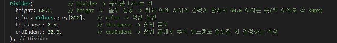
Divider( // Divider -> 공간을 나누는 선
height: 60.0, // height -> 높이 설정 -> 위와 아래 사이의 간격이 합쳐서 60.0 이라는 뜻(위 아래로 각 30px)
color: Colors.grey[850], // color -> 색상 설정
thickness: 0.5, // thickness -> 선의 굵기
endIndent: 30.0, // endIndent -> 선이 끝에서 부터 어느정도 떨어질 지 결정하는 속성
),
Text('NAME', // ,쉼표 후 Text의 스타일 설정 가능
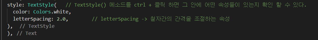
style: TextStyle( // TextStyle() 메소드를 ctrl + 클릭 하면 그 안에 어떤 속성들이 있는지 확인 할 수 있다.
color: Colors.white,
letterSpacing: 2.0, // letterSpacing -> 철자간의 간격을 조절하는 속성
),
),
SizedBox( // SizedBox -> 눈에 보이지는 않지만 두 텍스트 사이에 보이지 않는 박스를 넣어 가로세로 사이 간격을 조절
height: 10.0,
),
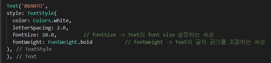
Text('BBANTO',
style: TextStyle(
color: Colors.white,
letterSpacing: 2.0,
fontSize: 28.0, // fontSize -> Text의 font size 설정하는 속성
fontWeight: FontWeight.bold // fontWeight -> Text의 글자 굵기를 조절하는 속성
),
),
SizedBox( // SizedBox -> 눈에 보이지는 않지만 두 텍스트 사이에 보이지 않는 박스를 넣어 가로세로 사이 간격을 조절
height: 30.0,
),
Text('BBANTO POWER LEVEL',
style: TextStyle(
color: Colors.white,
letterSpacing: 2.0,
),
),
SizedBox(
height: 10.0,
),
Text('14',
style: TextStyle(
color: Colors.white,
letterSpacing: 2.0,
fontSize: 28.0,
fontWeight: FontWeight.bold
),
),
SizedBox(
height: 30.0, // 설명 text와 체크 text 간의 간격 조정
),
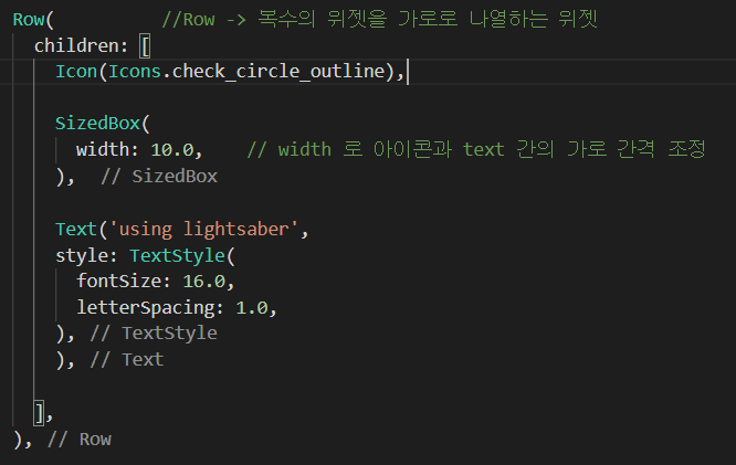
Row( //Row -> 복수의 위젯을 가로로 나열하는 위젯
children: [
Icon(Icons.check_circle_outline),
SizedBox(
width: 10.0, // width 로 아이콘과 text 간의 가로 간격 조정
),
Text('using lightsaber',
style: TextStyle(
fontSize: 16.0,
letterSpacing: 1.0,
),
),
],
),
Row(
children: [
Icon(Icons.check_circle_outline),
SizedBox(
width: 10.0,
),
Text('face hero tattoo',
style: TextStyle(
fontSize: 16.0,
letterSpacing: 1.0,
),
),
],
),
Row(
children: [
Icon(Icons.check_circle_outline),
SizedBox(
width: 10.0,
),
Text('fire flames',
style: TextStyle(
fontSize: 16.0,
letterSpacing: 1.0,
),
),
],
),
Center(
child: CircleAvatar(
backgroundImage: AssetImage('assets/fireBan.png'),
radius: 40.0,
backgroundColor: Colors.amber[800], // 이미지의 배경이 투명일 경우 백그라운드 설정 가능
),
),
],),
),
);
}
}[이미지 추가]

-> flutter에서 이미지를 사용하기 위해 먼저 assets 폴더를 새로 생성 한 후 이 폴더에 사용할 이미지들을 저장한다.
pubspec.yaml 파일에 들어가서
-> 이 부분을 ctrl + / 로 주석을 제거해 활성화 한다.
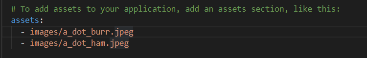
-> 해당 경로를 내가 저장한 파일 경로와 이름으로 수정한다.
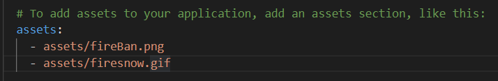
-> pubspec 파일은 들여쓰기에 상당히 민감하다고 한다.
-> 되도록이면 기존 원형을 그대로 유지한 상태에서 사용하는 것을 권장
[우측 상당 debug 띠 삭제]

-> 처음 볼 때부터 마음에 안든 이 debug 배너 띠를 지우는 방법
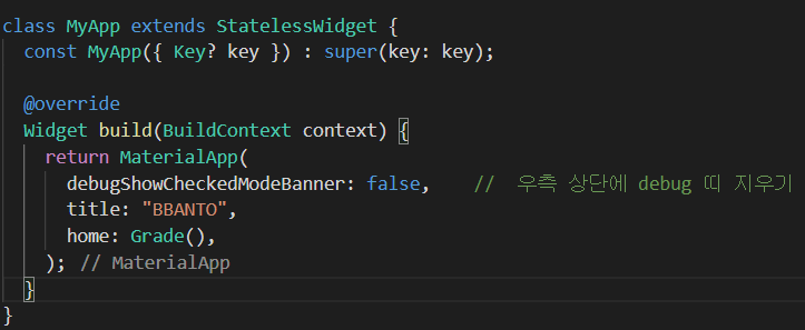
-> MateriallApp 위젯 바로 아래에 debugShowCheckedModeBanner: false, 입력
[배경 색 변경]
-> 기존 default에서 원하는 색상으로 변경하기
[컬럼 위젯 내 모든 요소 가로축 정렬]
[gif 이미지 출력(CircleAvatar)]
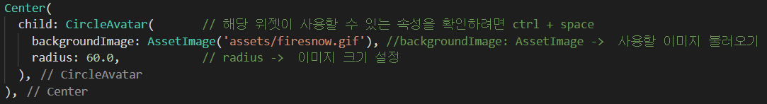
-> 아까 assets 파일에 파일을 저장하고 pubspec파일에서 경로를 지정했기 때문에 이미지 불러오기가 가능
-> 이 이미지를 따로 Center로 감쏴 놨기 때문에 혼자 중앙에 위치할 수 있다.
[Divider]
-> 이미지와 Text 사이에 구분 짓는 선 추가하기
[text 추가]
[SizedBox]
-> 위젯 사이에 빈 공간 추가

[Text style]
[Row]
-> Row는 복수의 위젯을 가로로 나열하는 위젯이다.
-> 위젯을 세로로 나열하는 Column 위젯과 유사
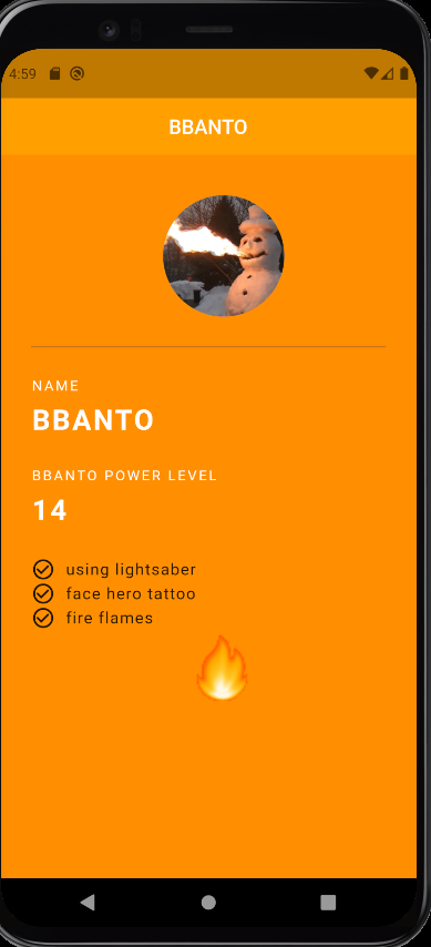
[결과 화면]
- 해당 게시물은 유튜버 코딩 쉐프님의 영상에 대한 학습 내용 정리 입니다.